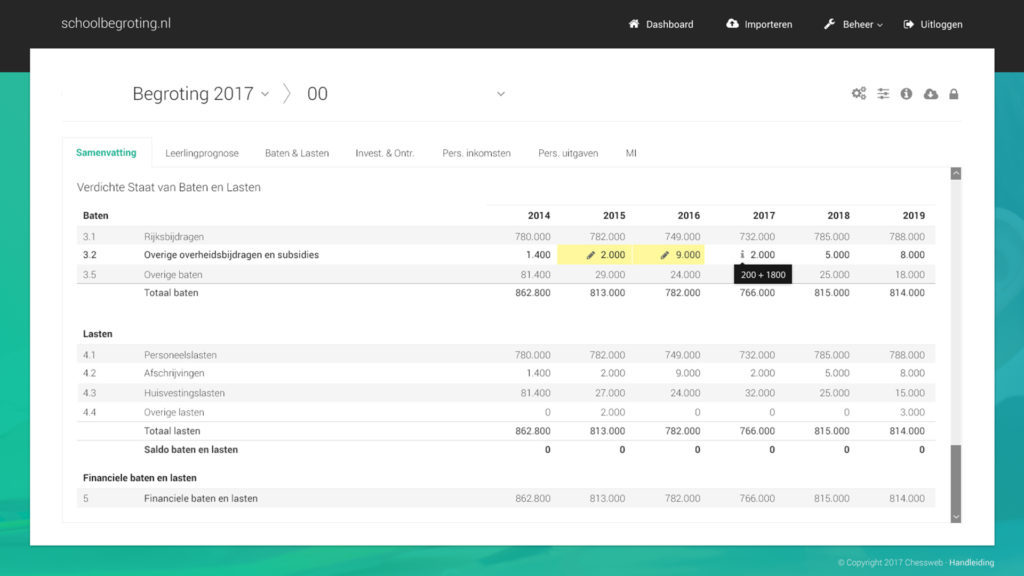
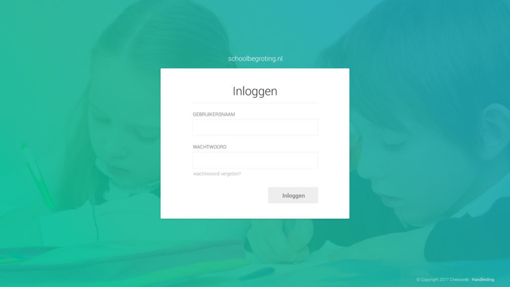
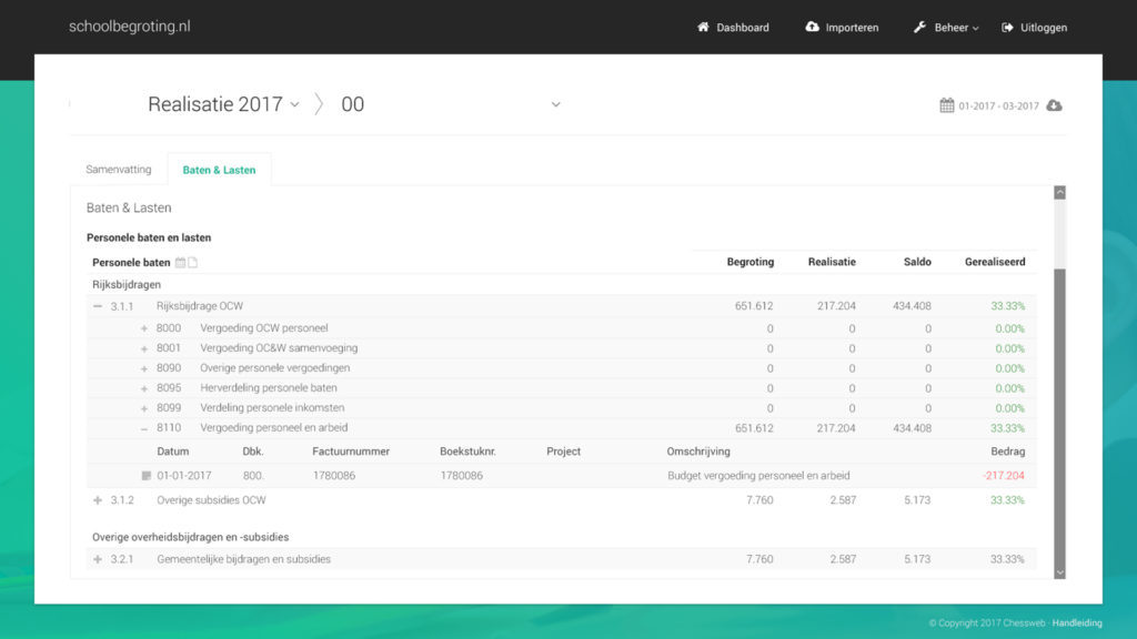
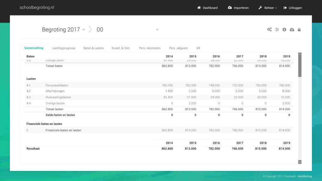
The developer of the accountancy application called schoolbegroting.nl approached me for a redesign of this platform, as it was also developed again.
A digital application with a large amount of data, editable fields and tables is always a nice challenge, so I happily jumped straight into this project. I started with examining the current design and identifying weaknesses and strengths in the current design.

Subsequently, I did research to the visual design of tables and what works best. Luckily, there are a number of researches available which indicate what table designs work best with users. These findings resulted in the design presented here.
For client requested improvements, I used an online prototyping service which enabled the client to click through the screens, test the designs and give feedback.


