The use of imagery is profound in websites, but takes a heavy toll on the loading times of websites. And this is even more true for smaller mobile devices, which often need to download the same images as their high definition counterparts. Although they can be scaled, their file size remains equal. Luckily enough, there is an HTML attribute for the image tag which can help to serve the right. It’s called srcset and sizes.
Responsive images used to be about scaling the image proportionally to the width of a device. A desktop would serve the full size images, but the same images would be scaled on devices, maintaining their proportion. The big caveat of this approach? The same HD, full size image loaded for a desktop was also load for a mobile device, consuming costly bandwidth. While there are several JavaScript and server side solutions for making images truly responsive, srcset and sizes make the implementation really simple.
The srcset and sizes attributes
The basic syntax for the srcset and sizes attributes can be defined as following:
<img src="hd.jpg"Â srcset="large.jpg 1024w, hd.jpg 1920w" sizes="100vw" height="1920" width="1080">
Basically, the syntax is saying the following: for a device width of 1920px, use the hd.jpg image. For a width of 1024px, use the large.jpg image. In this case, the sizes attribute explains that the image is utilizing the full width of the screen, here indicated by 100vw (100 viewport width). The beautiful thing about sizes is that you can use media queries inside the attribute, as depicted below:
<img src="600x480.jpg" srcset="320x320.jpg 320w, 480x384.jpg 480w, 600x480.jpg 600w, 1200x960.jpg 1200w" sizes="(min-width: 1800px) 25vw, (min-width: 1200px) 33vw, (min-width: 600px) 50vw, 100vw" height="480" width="600">
The above example explains that for a minimum width of 1800px, the image will span over 25% of the viewport width. From 1200px, this will be 33% of the viewport width. The values following determine the sizes for even smaller sizes. The above example is actually used on this website, on the projects page.
The best thing of srcset and sizes approach is that your browser will look to your current device width, and choose for the image that fits best within this width. By doing this, you leave all hard guess work of determining device widths the browser.
Next to srcset and sizes, there is also an approach possible with the picture element, but it is much more difficult to implement. If you want to read more about both the picture element using srcset and srcset and sizes within the image element, consider the examples from the Responsive Images Community Group.
Browser Support
At the time of writing this article, srcset is a relatively new feature (well, it’s first draft was proposed in 2012), and therefore full browser support is limited to Edge 13, Firefox 38+, Chrome 38+, Safari 9, Opera 25. For mobile devices, support starts from Safari 9, Chrome 44, Opera 30 and Firefox 40 for Android. To extend the browsersupport, there is a polyfill available. This polyfill is named Picturefill.
Srcset and sizes with WordPress.
In the upcoming version 4.4, responsive images will be included into core. At the time of writing, WordPress has a solution for it in the form of the RICG plugin. Please note that it uses all your registered images sizes, and thus image proportions might be different for several screen resolutions. And that brings me also to the following point: the art direction of images is important to consider as well.
It is also about art direction
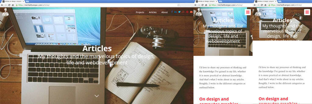
The srcset attributes has another big advantage: you can provide images with different proportions to different device widths. If an image just scales along with the size of a device, it proportion will always stay similar. A beautiful 16:10 screenshot will look a lot smaller on a mobile device if it is just scaled.
Srcset allows us to load a picture with different proportions for different devices. In this way, we can target the parts of the image that we want to be visible for each device. And thus, srcset can help in the art direction of images for multiple devices.

In the above example, an image on a page is shown on desktop size and mobile size. The image on the uttermost right would be the image if it was just scaled down. On the images to the left of it, we see a version of the image with different proportions as the image on desktop. By adjusting the proportion, the appearance improved in this example, allowing for the text to just stay ‘inside’ in the image.
Alternate ways of Image Optimization
Using srcset is one step to optimize images for mobile devices. It is a great solution, but requires multiple versions of one single image. If images can be rendered through vector like graphics, one should also consider using SVG. Since SVG is a scaled vector graphic, it can beautifully scale for all kinds of devices and pixel densities.
Besides the size in terms of width and height, there is obviously also the dimension of image size. There are numerous applications available for reducing image size by loslessy compressing the image, such as Website Planet Image Compressor (up to images of 50mb), TinyPNG, Kraken and Shortpixel (for WordPress).
I would like to mention one final technique, which alters the way images are load. In the most optimal case, only the images that appear at first glance should be the images that are load, instead of all images on a certain page. This is possible through a technique called Lazy Loading, which basically loads images once you arrive at their scroll position. If you are a bit savvy, you can implement it through use of scripts or plugins, such as Lazy Load XT.