Leading and Tracking respectively determine the space between lines and letters, and how great effect on how your typography is perceived. This tutorial will teach you how to apply leading and tracking in Photoshop. We will use a CD Cover as a underlying case for understanding leading and tracking within Photoshop.
Recently I read a magazine and saw a picture of a nice and simple CD-Cover from Israel Houghton. This tutorial is based upon the design of this cover. In this short tutorial we’ll make a CD-Cover using Photoshop CS3+.
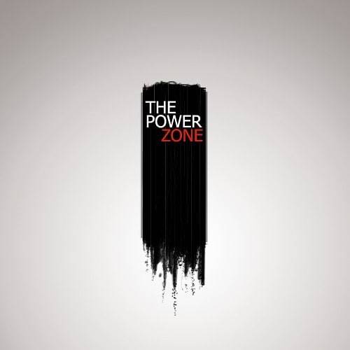
After this tutorial you’ll know how to apply to color schemes to a design, to adjust the ‘leading’ and ‘tracking’ of fonts and using capitals. The outcome of this tutorial is shown on the left.
What is leading and tracking?
In short, leading is the line-height between your lines of characters, and thus determines how far these lines are placed from each other. The line-height has great influence on the readability of your text. This readability is a relation between the amount of characters per line, the line height and the font used.
Tracking is the actual distance between the characters itself, but opposed to kerning, it is about the distance of characters in the context a whole word. Kerning, another typographic term, is about the actual distance between characters. Do you want to know more about Leading, Tracking and Kerning? Creative Market has a very insightful article concerning this topic.
Using a color scheme
![]()
Before actually opening Photoshop, we’ll look at the color scheme we are going to use. If you want to make a colorscheme on your own: Adobe Kuler (nowadays called color) is a great tool for making color schemes. We see that the main colors used in this scheme are white, grey and black, and a red/orange like color is used to create a sharp contrast. Color schemes are a must for making clean designs, as they provide a guidance for which color (ranges) to use, and prevent ending up with an all to ‘rainbowy’ kind of design. But let’s translate the color scheme to Photoshop!
Step 1: Creating the File
Create a new file (CTR + N or File > New) with the following dimensions (Please note: this is optimized for web preview, for print the resolution should be much higher, the dpi should be much at least 300 and the Color Mode should by CMYK):
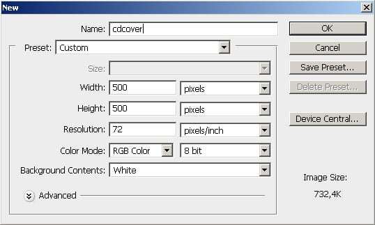
Step 2: Creating the background
Now add a new Layer (CTR + SHIFT + N or Layer>New>Layer) and call it ‘BG’ or ‘Background’. Select the Gradient Tool and draw a Radial Gradient, using the following colors:
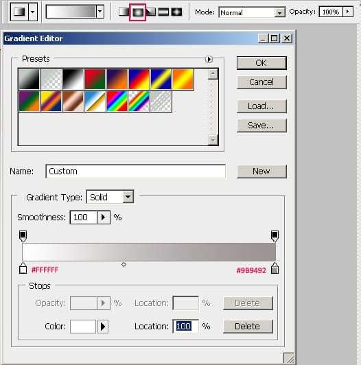
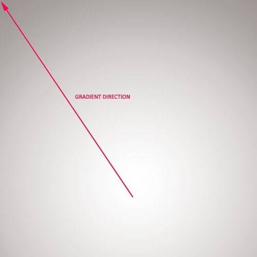
Draw it from slighty below the middle towards one of the corners, similar as shown in the image below:
Step 3: Creating the Foreground
No it is time to start brushing! The standard brushes of Photoshop will do here. Create a new Layer (CTR+SHIFT+N or Layer>New>Layer) and call it ‘Brushing’. Start brushing a shape using the Brush Tool (B) as shown in the picture below, using the 14px ‘Spatter Brush’ (also shown below).
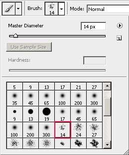
The color you should use is black (#000000). Hold SHIFT for drawing vertical lines. For the ‘tails’ at the bottom of the shape, decrease the Diameter of the Brush using ‘ [ ‘ . Keep brushing until you got something similar to below:
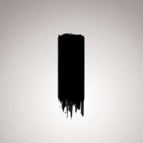
Add a new Layer (you should now the hotkey for it by now) and call it ‘Brushing Scatters’. Select the 1px Brush, color Black. Go to the Brushes Palette and set up Scattering on Both Axes, 500%:
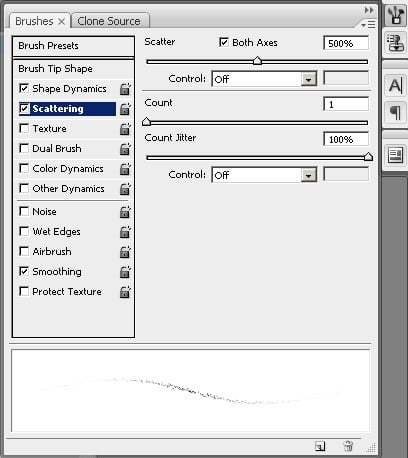
Start Brushing around the ‘tails’, and create some variation in the size of your scattered Brush (from 1-3px, use [ and ] ), so that you’ll end up with something that looks similar to the picture shown hereunder:
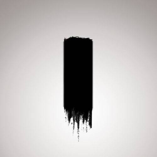
The black area is still having some lack of depth. Create a new Layer and call it ‘Brushing White’ Now select a 1px White Brush (B, D to reset for- and background color to Black and White, X to swap those). Make sure it Scattering, which was used in Step 4, is turned of. Draw straight vertical lines in the area whe brushed already. Also use different Opacity values for this, so that you’ll have something like this:

You might want to lower the overall Fill of this layer if it is still too bright. I lowered it to 60%.
Step 4: Adding the Text
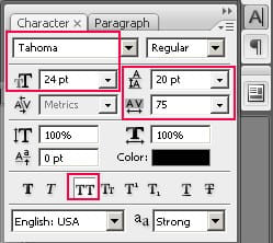
Aah, we could use some text! Create a New Text Layer, using the Horizontal Type Tool (T). We want the distance between the lines to be decreased, so the ‘leading’ of the font needs to be adjusted. We also want it all in capitals without using Caps-Lock. Go to the Characters Palette / Tab, and set the ‘leading’ to 20 pt, and ‘All Caps’ on. As you can see, you can just adjust the leading next to the area where you can adjust the font size. Secondly, besides ‘All Caps’ there are a lot of other options such as Subscript and Superscript. Also make sure that you have selected 24pt Tahoma as font:
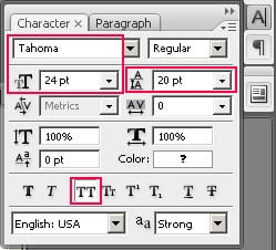
Now type the following text (or any other text you want, as long as it fits well!), in the ‘black brushed area’, as shown below. The red color used here is ‘#d32316’.
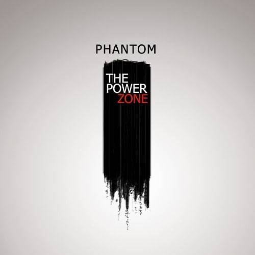
Somewhat above the ‘black brushed area’, create a new Text Layer and type ‘Phantom’ (or anything else you want). As you can see a ‘tracking’ of 75 was set up for this Text Layer. A positive tracking value will increase the distance between letters, where a negative tracking value will decrease it.
Now, we have to place any other text in a logical place of the cover. As the foreground is a large rectangular shape in the length of the cover, it forms some kind of a composition in the vertical direction. We can decide to emphasize on this vertical direction and place any other text in this line. Hence, I placed the text at the following place:
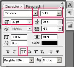
This is the final step, create a new Text Layer and type ‘George’ (or something else you like) exactly above ‘Phantom’ (you can see how it is done in the outcome). Use the settings shown below, so that it will be exactly as wide as ‘Phantom’. If you used your own (different) text, you can make other changes in Font Size, Font Style or ‘Tracking’ to make it fit.
And now we have arrived at the final picture:
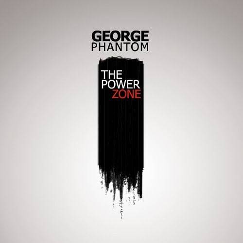
You can download the outcome of this tutorial below:
Download the .psd