Ever felt there is more to designing than creating nifty user interfaces and visually eye candy? Or felt the urge to explain what design actually is? Well, you are probably not the only designer unleashing his or her curiosity on the process and phenomenon of design itself. For myself, I just discovered something that my design education has not taught me yet. Oh yes, I learned about the methodology behind designing, the form that follows function, the processes that underlie good design. I learned about creative problem solving, defining and discovering the core of a problem and the importance of empathy for end users. The theory was lovely and very interesting. But I just found something that should not be kept out of the discourse.
Is it problem solving?
You might think designing is about creating beautiful interfaces. You might think it is building the most attractive products that work well. Or perhaps creating a kick ass logo is the pinnacle of design. In this article, I would like to move design more to an abstract level. To my opinion, design revolves mainly around problem solving, especially if you want to innovate with design. What can be deduced from the definition of design as problem solving are at least three things:
- There is a certain problem that needs to be understood or even found.
- There is someone having that problem with a need to have that problem solved.
- There should come a solution for the problem and ‘the someone’.
This definition of design makes it more versatile with respect to the different disciples of design. Designing a login interface for an application? You are solving a problem for a certain group of users. Designing a new vacuum cleaner for emerging markets? You are solving a problem (and probably finding new ones to solve). Now, the link between design and problem-solving is one that is debated. It remains yet important to think about design on an abstract and concrete level.
What might be so important then?
Coming from the definition of design as problem-solving, we might be able to arrive at other things that might be important in design. And there is another thing that to my opinion is insanely important: design is about uncertainty. A designer has to deal with uncertainties throughout his whole process. What problem do I actually solve? What are the clients preferences? What are my user needs? And there is one field of expertise which explicitly deals with uncertainties. It is the field of decision making, which deals with uncertainties and evaluating the odds of uncertain options.
“Good design is about decision making. It is about reducing decision options.”
Because uncertainty is taking place at different stages and levels of design, I would argue that design is also about decision making. Moreover, the one thing designers should know is that good design is about optimizing decision making. The simplest way to make designing both easier, better to oversee and in many cases better is to reduce the number of options you have to decide from. Subsequently and logically, the decisions that are made should devote all attention. And to make it practical, I put some practical appliances below.
Good design reduces your decision options
In digital design, there are a number of straightforward aspects in which decisions can be reduced. Think of Typography, for example. Typography and finding the right font pairings is often a task that is found tedious with endless choices. Want to keep it simple? Stick to only one or two fonts and focus on the implementation of these fonts. It is better to spend time on combining the right variations of font-weight, font-spacing and use of capitals than to search for the right font combination for hours (luckily, there are numerous tools for pairing fonts more easily).
Opt for a font scale
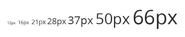
And what about implementing a consistent font-scale? Chose for a consistent scaling factor, such as 1.33 (4:3). Starting from the font base-size of 16px for your main text, you can define the font scales for your all your typographic elements in a range of 12 – 16 – 21 – 28 – 37 – 50 – 66. Having a consistent scale will often result in balanced typography and reduces the decisions you have to make. The same is true for choosing dimensions and using white space. By using one base-unit and multiplications of this unit, margins in your design can become much more consistent and consequently visually more appealing.
Make your designs lean
As a good designer, you look to the essence of a design. What message does it convey? How does it answer the users need? By focusing on the essential needs and requirements, design elements not attributing to these requirements can be disposed. For example, you might limit the number of buttons and user interface elements such as input fields to the bare minimal. It will make your work and the developers work a lot easier. Moreover, you have more time to focus on the interaction and actual design of the elements you are keeping. And it will result in more neatly style guides, style assets and a more modular design.
Modular design
Reducing decision options will also help you to make more consistent and modular designs. For example, the use of a grid allows you to streamline lay-out. You might be tempted to use all available columns, but don’t overdo it as it will clutter your grid. In addition, Modular design is a topic which also can greatly guide you in your design decisions. By thinking of a webdesign or even a physical product as a set of reusable components, or modules, you can save yourself a lot of headaches. By being limited to a certain selection of modules (such as a number of predetermined buttons), you are forced to use these components. This saves time to spend on more important decision decisions, such as the use of white-space and the visual hierarchy of your design and content.
Reducing decisions is not only applicable to digital design but also to physical products as well. While I will not go into detail here, there is one thing that I want to share: when design physical products, start from basic geometrical or organic forms and work on details in iterations. By only working with a limited number of shapes, it is much easier to estimate proportions and explore spatial dimensions for new product forms.
Now we haven’t talked about color, but you can imagine by now: less is more.
Good design reduces decisions for the user
I am sometimes sick of making decisions. I don’t want to choose between 100 types of cornflakes in a supermarket. Neither do I want to choose between one of the hundreds project management tools that are available. But I have to. In our civilization that is being overload with new and old information, simplicity feels like heaven. Hence, a good design also reduces the amount of decisions a user has to make. Obviously, usability and user experience should not be forsaken.
“A user should not be overwhelmed by the decisions he has to make.”
A user should be able to think about a design, but not be overwhelmed by it. A design should be self-explanatory and guide the user to the one thing he is looking for. The one example that comes into mind is the search bar of Google. Just one search bar. Not tons of other fields or cluttered news you don’t want to read. Only the option to enter your desired search term, and you are guided to the results. And if you reduce the amount of decisions a user has to make, it becomes a lot easier to follow the eight rules of interface design.
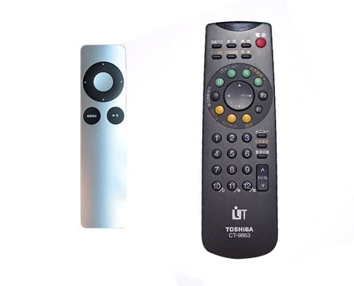
And have you ever used a remote control that was incredibly clear from its beginning? If is terrible to use new remote controls because it is filled with use cues (also know as buttons). Now this is obviously the most simple example, but there are tons of similar occasions. I once did a research to decision-making software and was surprised by the number of decisions some of these software packages for you into. It’s paradoxical. Nevertheless, the user does not want to make many decisions. Even better, I think they will love if they are effortlessly guided into their decision making and the design chooses for them. This is anticipatory design, and some say it will even be the new revolution in design. I think I will gladly join this revolution once it’s there.
Good design reduces complexity in strategic decision-making
As a designer, you are not only a craftsman. You can be an integrator between various fields of expertise and this is exactly where the strategic value of design comes on. As a designer, you mostly work with technology (either in physical or digital products), human values (the users) and business targets (a product has to be sold or a design enhances a business). You have to shift your gears frequently between the areas of technology (feasibility), business (viability) and users (usability and desirability).
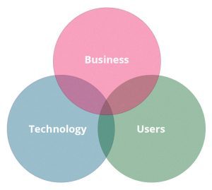
This is exactly where your design can become a bacon for a common understanding between these three fields of expertise. Your design can become a boundary object. An object which people from different fields of expertise or different organizational silos can relate to. And such an object makes it significantly more easy to proceed with innovation and idea implementation than only forecasting, meeting, and planning. I would even say that the complexity of today’s world craves for design in the aforementioned appliance. A good design represents an underlying organization and context, but also uncovers its shortcomings.
Now these are three broad areas in which good design adds to reducing decision making options. You possibly might think of other areas as well. In the end, there is one thing we must not forget. This might even be contradicting my own standpoint. Designing as a process is also exploration, meaning it will generate options to decide from. It is our ability to make decisions that will reveal the gold in these options. But that would be a topic for another writing.